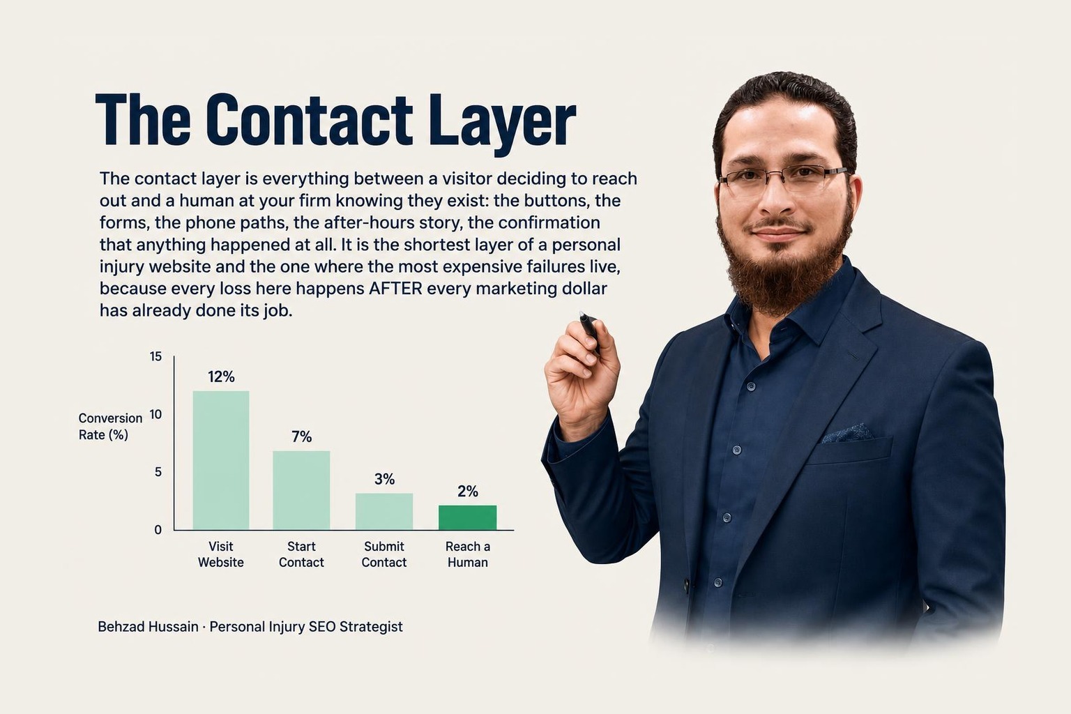
The contact layer is everything between a visitor deciding to reach out and a human at your firm knowing they exist: the buttons, the forms, the phone paths, the after-hours story, the confirmation that anything happened at all. It is the shortest layer of a personal injury website and the one where the most expensive failures live, because every loss here happens AFTER every marketing dollar has already done its job. This piece is the anatomy of that layer: what belongs on the first screen, what a form should ask, what the rules actually permit, and the silent failure that should keep owners up at night.
Everything upstream of the contact layer is paid for by the time it matters. The ranking was earned, the click happened, the page persuaded. The visitor's thumb is hovering. The remaining distance to a signed case is three centimeters of screen, and the vertical's own economics make every failure in those centimeters absurd: this is the industry that pays the highest click costs in search, then routes the resulting humans into fourteen-field forms and unanswered phone trees.
The machines are watching the same centimeters. Google patented calibrating click duration according to context, US 8868565: how visits end, and how quickly, is signal, interpreted against what the page and query were. A practice page that visitors flee because they could not find the way to act is not just losing those humans. It is teaching the system, visit by visit, how the page performs. Conversion failure and ranking decay are not separate problems; they share plumbing.
One more patent is worth knowing because of where it points. Google patented automatic routing of search results to a call, US 8312042: a voice query, a location, and the system treating a phone call as the natural completion of a search. The machinery has assumed for over a decade that the endpoint of local intent is a conversation. The firms whose contact layer agrees with that assumption inherit the intent; the ones that bury the phone number argue with the plumbing.
The non-negotiable: a tap-to-call action AND a short written channel, both visible before any scroll, on the devices claimants actually hold.
The call button serves the person ready to talk. The form serves everyone else, and everyone else is a bigger group than this industry admits: the person in a hospital bed at 1am, the spouse researching from a work computer, the one who cannot say the words out loud yet, the one whose English is stronger written than spoken. A phone-only contact layer silently tells all of them to try the next firm. Almost nobody in this vertical offers the written door prominently, which makes it one of the cheapest differentiators available: being reachable by the frightened is a strategy, and it costs a form.
Placement is the test. Not whether a form exists somewhere below the awards, but whether both doors are standing open in the first screen of the pages where decisions happen: every practice page, every location page, the homepage, the attorney bios.
The form itself is where firms sabotage the door they finally built. The errors run in both directions.
Too much: fourteen fields, demanding the whole story before saying hello. Every field is friction, and friction at the moment of fear is attrition. The form's job is not intake. It is contact: name, a way to reach you, a sentence about what happened. Three to five fields. The interview happens in the conversation the form exists to start.
Too much is also a rules problem, and this is the part most marketing vendors have never read. ABA Model Rule 1.18 governs prospective clients: people who consult a lawyer, including through a website, acquire protections, and information collected before a conflicts check creates real obligations. The rule's own commentary points at the design answer: reasonable measures to collect no more than needed to check conflicts before the relationship question is settled. The compliant form and the converting form are the same form: short, early, and modest about what it asks. Confirm the specifics with your own state's rules and your counsel, but the direction is friendly, not hostile, to good design.
And one reassurance owners constantly get wrong: responding quickly to someone who contacted YOU is not solicitation. Rule 7.3's restrictions govern contact the lawyer initiates. A prospect who reached out first has invited the response. Speed in answering your own inquiries is service, not an ethics risk.
Here is the failure mode that outranks every other in quiet damage: the form that stopped working, and nobody knew.
Forms are software. Software breaks: a plugin updates, a notification email starts routing to a mailbox someone abandoned, a spam filter eats the alerts, a redesign ships with the submit handler pointing nowhere. The page still looks perfect. Visitors still fill it in. The confirmations even fire. And the messages land in a void, for weeks, while the firm concludes the marketing stopped working.
I check this in every audit, and I check it the only way that counts: submit the form, then trace where the submission actually went and who actually saw it, including after hours. The ritual every firm should steal takes five minutes a month: someone submits a test inquiry through every form and calls the main line once, off-hours, and confirms a human saw both, with a timestamp. Put it on a recurring calendar, owned by a name. The firms that do this never star in the horror story. The horror story is exclusively populated by firms that were sure someone would have noticed.